Monday, 7 March 2011

The Final Post.

Dear Mr/Mrs/Miss Moderator, Here is my completed coursework for my A2 Media Course.

At the beginning of the A2 course, which we began at the end of our as year, we took part in creating our first music video in large groups.

Once this was completed, we evaluated it and the yea came to an end.

Once the following year began, our research period also started, this started in September and ended by the Middle/End of October and the planning period began. This took place until the end of term in December and also included our print production work.

After this the video production period took place. This ended on the 11th of February.

After this our evaluation occurred until the 4th of March.

This blog is now complete and ready for your assessment.

Friday, 4 March 2011

Question 4.

How did You Use Media Technologies
in the Construction as
well as
Research,
Planning
And Evaluation Stages?

Software:

Blogger: By using blogger, I was able to upload all of my work to the internet instantly for it to be publicly viewed. This website shows the effects of media 2.0 on the way we work. It has meant that I can access my work from any computer and can do my work almost anywhere.

Photoshop: This programme gave me the opportunity to be creative. It allowed endless possibilities with photo editing and vastly improved my shots that I used for my Digipak / Advert. I don't think that any other programme would have allowed me this creative freedom.

OnLocation: This is the programme used to capture our footage once it had been filmed. It was very useful due to its ease of use. It meant that the capturing process was quick and easy.

PremierPro: Premier pro is what our production work completely relied upon. Without it we would not have been able to edit our video, which is a key factor in terms of music videos, especially ours. Its ease of use and vast possibilities for effects made it very helpful. However, The college computers limited us somewhat. Due to CS5 being such a new and advanced set of programmes, the old college computers struggle to run them, therefore from time to time, whilst importing captured clips, the whole programme would crash, deleting all unsaved work. Had it not been for the college computers, I feel that I would have been able to make progress much faster then I did.

Facebook: This was a useful website for the evaluation stage of my project. It allowed me to gain useful audience feedback and get exposure for my video. It made it far easier to share the link to my video and allowed plenty of people to see it.

Youtube: This website was the means of showing our video publicly on the internet. It is the most used video website and would therefore be perfect. Also, this website is how I've accessed the videos that inspired me to create my video. This is why I believe technology has played a large part in my production work. Besides the basic necessities of a camera etc, many argue that technology isn't playing a part in their production work, however, without access to other videos, how are we able to see how a video is supposed to be constructed? It has also meant that I could upload my video and then also add it to my blog. Whilst this website is extremely useful and renowned, it does have its flaws. Recently it has been noticed that the website is having some serious errors and is causing it to be very difficult to view videos. Error messages are seen or videos only play till a certain point, then refuse to continue. This could cause many issues during the evaluation period.

Hardware:
Mini DV Camera: At the college we have access to HD cameras, however, they are limited in supply and in extremely high demand. Therefore, in order for us to finish our work on time, we needed to use the older cameras. However, these machines are filled with flaws.One of which simply being the quality of footage, being as our video was based on visual pleasures, having a low quality image does not help achieve this. Also, with my video being filmed in outdoor locations, the fact that the battery life on these cameras was no longer then an hour was a large hindrance. If we had the opportuinity to use the HD cameras, I believe that due to our better footage we would have had a genuinely better video.

Samsung Wave BlackSamsung Wave Mobile Phone: I used my mobile to connect the calendar with my timeplan that I had created on the college network. This way I would get a notification on my phone to tell me that a certain piece of work was due in. This was useful as I wouldn't necessarily be accessing my timeplan each day and could therefore forget personal deadlines. By having updates telling me that certain work should now be done, I was able to keep on track. This was especially Helpful with the construction of my video as well as the planning.

Research: In terms of research, the main things I used included: Photoshop, blogger & Premier Pro. Premier allowed me to practice stop motion, photoshop allowed me to experiment with colours using tools such as the Lasso.

Planning: The Main thing I need for planning was my phone. Without It I would not have been able to contact my group and organise filming days.

Print Production: For my print production I massively relied upon photoshop. Without it I could not have created it. Using the tools available on the programme I was able to change colour saturation etc to alter the black/white levels of my photography.

Video: My video relied upon OnLocation as well as Premier Pro in order to capture my footage and edit it effectively.

Question 3:

Question 2.

Question 1.

Tuesday, 8 February 2011

Updates.

The second filming date is complete and some good footage has been achieved. We managed to capture the performance element of our video as well as some more visually interesting footage. The clips have been captured on Adobe Onlocation and the editing process has already begun. We have reached the halfway point in our video now and good progress is being made.

Friday, 28 January 2011

Responses.

From my video draft I have received many positive comments. The main focus of the comments is orientated towards the idea of the morph suits and how they create interest within the video. My target audience seem to be enthralled by the use of bright colours and unusual costume idea.

However, I have also received some constructive criticism. This is that a performance element would be very well received. Now that the idea of morph suits has been established within the video, my audience want to see something different, i.e. Performance. We already had this planned, and will be filmed on the 6th of February. However, from our animatic, it is evident that we were going to save the performance till the end of the video, however, from this feedback, I believe it will be more effective to tie the performance in early on to entertain the audience and stop the morph suit idea from being repetitive and causing our audience to get bored.

Thursday, 27 January 2011

Skills.

From working with the material that has been filmed so far, my editing has seen improvements. This is the first time that I have worked on a project where the timing of the editing is so crucial. The cut shots have to be in time with the backing beat and so far I believe this has been achieved successfully. Also, after viewing the footage we achieved, I have learned from my mistakes and will be able to take these with me to the 2nd filming session. An example of this would be that the characters need to be still for longer so that we can get the desired effect with our stop motion.

Rough Draft.

Delays.

With a group member ill (Andrew Moss), filming has been delayed by a week. We will now have our 2nd filming session on the 2rd of February and our 3rd filming day on the 6th of February for it to be edited and complete by the 11th.

Friday, 21 January 2011

Video Update 1:

First day of filming is complete and all the shooting for our first location is over. One of our group members couldn't make it due to a last minute call from work. However, we still achieved everything we have set out to do. Editing is now taking place and we have our second filming day on Sunday containing our performance elements.

Thursday, 23 December 2010

Casting.

I have chosen my cast who will play the band members within my video.

Dave Hill.

Julien Bicknell.

Will Lucas.

Jack Morris.

These 4 characters will all play different Instruments, these will be:

Bass.

Drums.

Guitar.

Vocals.

Friday, 17 December 2010

Final Advert.

Final Digipak.


The Large black ring in my upper middle panel Is not part of My design, but being used to show where the CD will Be held.

Photo Editing.


To begin with, to create my desired effect, I had to go to Filter > Artistic > Film Grain.


Once I had Done this, a separate window was opened to allow me to precisely change the amount of grain I wanted, as well as Intensity and Highlight area.


After selecting my exact settings for my film grain effect. I went to Image > Adjustments > Black and white.


After doing this, a 2nd window opened again to let me choose exactly what type of black and white I wanted. Not only was all colour drained, I could also choose how much of each colour, used to create the black and white effect, I wanted. This gave me many different results until I found a result I was pleased with.

Thursday, 16 December 2010

6th Cover.

I decided to chose a different fotn as the other was seen too simple when shown to an audience. Comments such as

"It just looks a bit rushed"

were used to describe the font. After choosing this new style, my audience seemed far more positive and it has been seen to look more professional.

Tuesday, 14 December 2010

5.

Added a drop shadow to the font to create more impact. Also tidied up the edges of the liquefied image to re-establish the original square outline.

Number 4.

Added the song title for our video as the album title and tried being more accurate with the Liquify tool to stop the edges of the image from also being warped. Sadly, I was not accurate enough.

Attempt 3.

For this effect, I have used the Liquify tool to blend and smear the previous splatter effect to create an almost "Tie Dye" effect. I Have also added a white border as this has allowed the font to be more easily read. Also, with my photography being black and white, this will create a better transition between panels.

2nd attempt cover.

Changes of the font placement, size and spacing have taken place to create this effect. I have not yet edited the font itself, but have simply tried a different layout.

Basic Start To Cover.

By Adding my chosen font to my cover, I can See that it has a strong possibility of being my final choice. However, There are problems with the cover at the moment. On of which being that it looks very basic and amateur. I believe that the font needs to be edited to create a more powerful Image. At the moment, it does not seem as if this cover would be seen in an actual store on the shelf next to other products and therefore needs improving.

Font option.


I have found a possible font to be used for my cover. From previous covers I have noticed that the band use basic block lettering, therefore this fits that convention. Also, The style of the font is retro and fits with the connotations that the music gives of retro Britain.

Background.

I decided to create a massively colourful background for my Digipak cover.

I did this as the main theme for my video is also colour. I used the same 4 colours that will be used for my music video costumes: Red, Green, Blue and Yellow. I used a splatter effect as it is unorganised and connotes feelings of rebellion and youth.

The rest of my Digipak will probably be far less colourful and possibly include black and white photography.

Background creation.


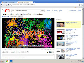
To create a splatter effect background several steps were needed to be taken. Firstly, I had to find an effective brush type. To do this I used a Youtube guide containing links to relevant brush downloads.


Once I clicked on of the link, a Webpage showing an example of the brush style was given with a download option.


Once I downloaded the brush types, I opened up a photoshop document with the sizings I have given on my blog of standard cover sizes.
(138mm x 125mm)


Once I opened the page, I was able to access 10-20 different brush types that previously weren't available in my brush Presets. These were then used to create my Paint splatter background.

Thursday, 9 December 2010

Storyboard Explanation.

Our storyboard has been largely Generalised To begin with....

Shot 1-6 (0:00-0:05): In the 1st six shots we will see that characters move forward with jump cuts in rhythm with the intro to the song.

Shot 7 (0:05 - 0:18): We will get a fast-forward set of shots of the 2 characters moving backwards and forwards randomly. We used one shot to show this as its easier to explain with words then with storyboarding.

Shot 8 - 10 (0:18 - 0:33): We get the introduction of the 3rd character who rises into camera shot and joins in with the choreography / movements. The 4th character is seen to jump over the camera from behind to join the shot.

Shot 11 (0:33 - 0: 50): Choreography and movement will occur until the 1st chorus begins. By the time that the chorus has begun, the characters will have lined up center shot. A long shot will be used so that all characters are fully shown. We will be using jump cuts so that the characters colours will rotate and change on screen similar to the clothing changes of Bombay bicycle Club's Evening/ Morning Music Video:


Shot 12 (0:50 - 0:51): With the characters remaining the exact distance from the camera, and the camera remainin at the same height and angle, we will then switch locations, creating a Jump cut effect similar to the colour changes, but instead, the whole location will change.

Shot 13 (0:51 - 1:08): This idea for movement could be very effective. Instead of having the characters simply walk or do an overused method of "unusual" movement. We will have jump cuts, that rotate the order of colour, this will create a leap frog effect. E.g.

Red - Green - Blue - Yellow..........Green - Blue - Yellow - Red ............Blue - Yellow - Red - Green

Shot 14 (1:08 - 1:21): Once we have had some shots of the characters moving in this way, we will have them on a large set of stairs, which we have already located. We will then Continue our colour change rotation theme.

Shot 15 - 16 (1:21 -1:40): As the 2nd chorus begins, we will have the characters leave the staircase, using jump cuts, and the begin another sequence of choreography or random movements depending on the effect it has with the costumes being worn.

Shot 17 Onwards (1:40 -2:43): We will then have another location switch, in this new location, we will see the characters in front of a set of garages, which is a common aspect seen in indie music videos. By switching scenery slightly before the music change, it will allow us to show the characters picking up there instruments before the change occurs. When the music does change, the pace increases, and at this point we will have our video reflect this as it changes to a performance video similar to the start of Vampire weekend's "A-Punk":


In these last few shots we will see the characters remove the heads of their morph suits, and possibly the whole suit to see a new set of clothing similar to the fashion that the music connotes.
The pace of the performance will change and jump cuts will be used to change the positioning of the band members.

Wednesday, 8 December 2010

Storyboard.


Audience Feedback.


By using the social networking site Facebook, I was able to get feedback on one of my cover ideas.

This has been useful as it has allowed me to see which aspects of this cover are likeable and which are not.

I feel that the use of bright colours is a must after receiving this feedback.

Monday, 6 December 2010

Colour Pop rough attempt.

Had a Quick go at creating a colour popping image as I will be including this With my print Production but have yet to start my own photography.

Font Findings.

Fonts Now have to be manipulated on Photoshop rather then downloaded from the internet. However, this does not hinder my research of fonts useless, it simply means that I have a template to work towards.

Friday, 3 December 2010

Font Research.

I've decided that a retro, simple font is necessary for my digipak. Using www.dafont.com I have done some research into fonts that may be usable for my print production.

Font 1:


Font 2:


Font 3:

Stop Motion Pen.

Reflection Upon Technology Week.

After finishing technology week I have managed to complete a couple of my targets.

The first thing was to try stop motion animation. I have managed to create a short clip which I will upload shortly that shows my first attempt at this type of animation.

I also had a play with adobe after effect but sadly didn't achieve a final product to show within my blog.

However, my other aim was to experiment with the new college cameras. The problem with this is that every member of my class also had the same idea. With cameras being limited, I was unable to actually get a chance to use it this week but will use them as soon as possible as its necessary to understand the functions of the camera.

My motivation to develop my technological skills is based on the fact I hope to continue my studies into further education. I feel that by furthering my knowledge of technology, I will not only improve my final coursework project, but I will also improve my chances of progressing into university courses based around film and media.

Thursday, 2 December 2010

Digipak Layouts

There are many different layouts for digipaks. They vary in size and layout. Sizes tend to be similar and are around 12 cm x 12 cm.

Here we see my first example of a digipak, the measurements aren't the same, but no 2 digipaks are.This digipak however is a bit too simple for what I'm looking to design. I prefer a fold out digipak similar to the following:


This Design allows for a fold out digipak. It contains 6 panels, one of which includes the actual disc in full view rather the a 2 panel digipak that simply has a front and back that allows the CD to slide in and out, these are often seen in CD give-aways with newspapers.

Print production Ideas.


Monday, 29 November 2010

Technological Aims.

My 1st aim is to get to grips with the new cameras we have in college. I have yet to use them so will need to get the hang of the controls and functions so that filming can take place more smoothly.

Also, I need to try Jump cuts / stop motion. I can do this whilst playing with the new camera and can therefore save time if I do both at once.

Another target for me to complete is to experiment with Adobe After effect. I have yet to use this programme but it comes highly recommended to create special effects within film. This may be useful for my idea to filter most colours but not all from my shots.

Sunday, 28 November 2010

Tokyo police club Digipak research.

I have done some research into previous digipaks for Tokyo Police Club and there past 3 covers are as follows


From these we can see that, Tokyo Police club favour simplistic designs and fonts. These covers are in reverse Chronological Order, as we can see, as the band have progressed, their designs have become more intricate. However, they have not become overcomplicated and are still simple. From these designs I can take some ideas and inspiration for my own digipak. I now know that my design must be simple yet effective and cannot contain many words. The fonts have to be standard and readable. Also, a title for the album is not necessary as we can see from their newest release "Champ".

Friday, 26 November 2010

Photoshop.


First attempt at adding a coloured image to a black and white image to cause the colour to stand out far more and have more of an impact.


Creative Task Look Back.

For the last week we have been given the task to focus upon the concept of creativity. Whilst doing this I attempted to create a mock digipak cover on photoshop as well as sketching up a few design ideas that I will be scanning in and uploading to my Blog soon.

Thinking creatively to spontaneously generate ideas can be very difficult. Sir Ken Robinson gave a lecture giving his idea upon creativity and schools and shared his belief that creativity is as important as literacy. He also said that if you are not prepared to be wrong, then you will never create anything original. I agree with Ken and feel that my education has been following the trend of creating fear with being in fault.


Robinson also mentioned that we are born with a creative wealth, however education slowly squeezes this out of us. However, I'm not sure I agree with this. Whilst we are extremely creative whilst young, it could be down to the fact we are highly stimulated through colourful imagery and sounds as learning material. For example, if a child was born within a white room and left within this white room, they would know nothing other then whiteness and therefore would not be able to think creatively.

Tuesday, 23 November 2010

Results of Creative Thinking.

I began to play with photoshop to create some images and begin creative thinking. However, at this point in time, I used images that I did not create.


To begin with I choose 2 images that clashed each other in terms of Connotations. Firstly, a grenade symbolising violence and death as well as a colour wheel which is bright and connotes happiness and joy.
After Having retrieved these images, I decided to merge them, to create 1 image using photoshop and the magnetic Lasso tool.


Attempt 1:


After having finished this attempt, I edited it again to create another attempt.


The Only difference between attempt 1 and 2 was that I re-introduced the harsh black outline of the grenade.


Once I had an image I liked, I added it to a band image and included some photoshop editing.


Attempt 1 of Digipak cover:

Tuesday, 16 November 2010

The Pitch.

Our pitch took place on Friday the 12th of November and this Was the Slideshare we used to help our presentation:


Pitch Feedback.

Whilst our pitch took place, our Audience/class took notes on specified areas of our idea and commented on both positive and negative aspects of our pitch. After our pitch was completed we were then given these sheets as feedback so that we could then review our own ideas and make changes if they were necessary.

I have scanned in a few of these sheets and they are as follows:

From our first piece of feedback we can see a very positive response. They have mentioned how realistic of an idea we have as well as how well we have planned out our idea. They commented on how our shot choices and costume choices will create an exciting video. However, not every comment was positive and the idea of our black and white background with a coloured character was seen to be very difficult and possibly not achievable. From this it is clear that we must focus on techniques to create this effect more then we previously thought we would have to.


From our second scan of feedback we can see that
our idea wasn't seen to match our target audience. Due to our feedback being anonymous, I cannot question why this is the case, but it has allowed me to realise that maybe our ideas were confused when communicated verbally. Therefore more audience research is needed to create a more detailed image of our desired audience member. Also, the viewer of our pitch was realistic and mentioned the expenditure for our costumes. However, we have already researched into this and will only need to be purchasing 2 costumes if all goes to plan and will come to a total of £70.


Our third piece of feedback showed us that our idea was original, this was one of the key factors that we were aiming to achieve, originality is essential, whilst also continuing to create a realistic and believable music video. They also mentioned how our logistical ideas were realistic and achievable. In terms of negative feedback, we can again see the concern in creating a coloured character on a black and white background.

Beginning of Time Management.


The start of my time management has begun. By organising my time effectively, my work rate will increase and I will be able to become more efficient with my coursework research as well as print production.
Due to having 2 things to do at once, it can become difficult to keep on top of it all. By using Microsoft outlook and synchronising it with my smart phone, I am getting notifications everyday about what tasks are due to be finished. It will work as a reminder about my general task as well as a further detailed description of what is necessary to complete.